by Alexandra Hammond
Margrit Lewczuk’s bright paintings titled Connie’s Drum and Green & Purple were installed facing her husband Bill Jensen’s intense diptych Passions According to Andrei (Rublev/Tarkovsky). The adjoining wall was hung with a cluster of eleven of Lewczuk’s smaller paintings, drawings and collages interspersed with eight of Jensen’s brush drawings in black ink. Where Jensen’s work is steeped and somber, Lewczuk’s is fresh and subtlety irreverent. These distinct approaches to abstract painting were created and shown in conversation.
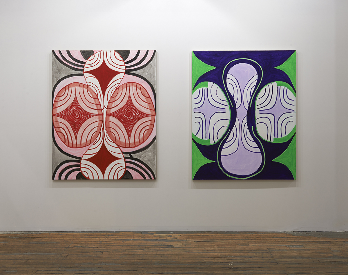
Margrit Lewczuk, “Connie’s Dream,” 2006. Acrylic on linen, 60 x 48″. “Green & Purple,” 2008. Acrylic on linen, 60 x 48″. Courtesy of the artist. Photo by Brian Buckley.
Connie’s Drum and Green & Purple toy with pattern and symmetry but remain unbound by their strict rules. Connie’s Drum in (red, pink, gray, and black) and Green & Purple (in vibrant lime, deep violet and pale lavender) both center on the vertical form of an elongated, rounded hourglass, pushed in at the waist on right and left by ovular forms and supported top and bottom by rounded base and capital, like the silhouette of some hybrid child of an Ionic column and the Venus of Willendorf.
Mexican god’s eyes, the markings of butterfly wings, African waxprints and Ukrainian Easter eggs come to mind. Background and foreground alternate. The viewer can choose whether the concentric, semi-circular lines are in front, and whether or not they connect on this plane of reality or in some paradoxical space within the painting, an infinite space akin to the path of the Celtic knot or the labyrinth. We could see these works as off-the-cuff infographics for mediation, aided by the interaction of color. Lewczuk’s blithe brushstrokes seem to smile into the quantum dimension they make visible.
When I asked Lewczuk about the relationship between her paintings and Jensen’s she said that it could be described as, “same but different.” Their home and studio in Williamsburg feels more like an old Mediterranean or Southern Chinese courtyard house than something one would find near the East River. Both artists’ sensibilities are nested in this place. Both are painters and abstractionists: same, but different.

Bill Jensen, “Passions According to Andrei (Rublev/Tarkovsky),” 2010-11. Oil on linen, 53 1/2 x 78 1/2″. Courtesy of the artist. Photo by Brian Buckley.
Jensen’s studio feels distinctively Old World. Light filters down through metal-framed skylights onto pots and pots of hand-mixed oil paints. Books of ancient Chinese poetry, and Renaissance paintings lie open to key spreads. The study of specific visual modes and strains of thought is apparent, and yet the sketches made from these are turned upside down, remixed and reconfigured by the artist, blending references across centuries. Passions According to Andrei (Rublev/Tarkovsky) is no exception.
The diptych is comprised of a mostly white canvas at right centered vertically against a slightly larger densely-colored canvas at left. In the case of Passions, whiteness does not equate with lightness. The weight and solidity of the right-hand section is undeniable. Layers of primer have been troweled on, sanded down, the process repeated. It’s like the wall of an ancient building, smooth and gently mottled with the patina of ware. Floating in the center left of the composition are mirrored shapes, more sculpted in low relief than rendered on the surface. The lower form bleeds off to the next canvas and turns to shadow there. The forms are mysteriously organic: falling angels, heavy grazing animals looking at their reflection, the gnarled shells of fossilized sea creatures. The adjoining canvas throws us into a coexistent dimension, roiling and intense in deepest violet with moments of ochre and burnt sienna. There is something of the rapture of El Greco’s skies here, a deep spiritualism that is offbeat, personal and esoteric.
The work’s title refers to the 1966 film The Passion According to Andrei by Russian director Andrei Tarkovsky, an interpretation of the life of Medieval icon painter Andrei Rublev. Jensen derived the mirrored, floating shapes, which appear in this piece and others, from Rublev’s icon of The Trinity. The film traces Rublev’s loss of faith, and its recovery through the witness of another artist’s miraculous creation. The juxtaposition of two canvases in Jensen’s piece speaks of what he calls a “fracture in time and space,” but perhaps it is also a strategy for conveying life’s deep sorrow and its opportunities for redemption.
Encountering Lewczuk and Jensen’s work, one feels a renewed sense of the relevance of abstract painting, and also, perhaps, that abstraction is the wrong term for a way of making pictures that are not figural, yet are rooted in the specifics of place and human emotion. This is a different meaning for relational aesthetics, an aesthetics built up over decades of relating. The works offer two perspectives on a co-existence: same, but different.