The Beginning
by Phong Bui
Some memories are like friends in common; they can effect reconciliations. 1
-Marcel Proust
When I was growing up in Hue, Vietnam, in the late 1960s and 1970s, two primordial forces of destruction colored my life. The first force was man. Just as it did the country, the war divided members of my family—after the Geneva Conference in May 1954, one-half went to the north, the other half remained in the south. The second force was nature. Because of Vietnam’s tropical wet climate, monsoons constantly flooded the land. (I remember on one occasion our family stayed on the second floor of our house for two weeks; after another storm, my siblings and I went to school by boat.) Since then, I’ve seen many reminders of man’s potential for destruction. Endless conflicts have afflicted the world since my departure from the old country and arrival in the US in 1980. But my memories of the potency of nature lay dormant until “Superstorm Sandy” abruptly rekindled them in October 2012.
The night before the storm’s arrival, the New York City subway system shut down at 7 pm. That same evening, my solo exhibition was scheduled to open at Showroom Gallery on the Lower East Side. Curiously enough, that exhibition (Work According to the Rail, Part I: After the Flood), was titled after what then seemed to be a devastating event—a relatively minor flood that had destroyed some works in my basement-level Greenpoint studio a few weeks earlier. Too excited (and logistically overwhelmed) to postpone the opening reception, we simply moved it up to 5 pm. Despite the early opening time, a crowd gathered at the uncharacteristically early opening undeterred, disregarding the eerie mood that was settling over the city. It was an oddly exemplary New York moment.
The next morning, my wife, a friend with a neighboring studio, and I set to work battening down. We covered tabletops resting on three-foot high sawhorses with everything we could fit: oil paintings, works on paper, books, art materials, equipment, and everything else we hoped to safeguard from the storm. We sealed the doors and windows with insulation boards and weatherproof expanding foam. Despite our thoroughness, when we finished our preventive efforts, our faces were filled with expressions of apprehension; we were hoping against hope that Sandy would be much milder than the news predicted. After all, the previous summer, Mayor Bloomberg had ordered an unprecedented mandatory evacuation of the city’s coastal areas in anticipation of Hurricane Irene—only to have the storm fail to inflict much damage. So it was with some optimism, and a certain amount of self-denial, that we waited for the storm to hit, hoping that the media’s predictions were simply overblown.
Sandy made landfall that evening. By 9 pm, the water level was rising. We decided to wait it out in the Rail headquarters on the second floor of our building, even though we were located in the mandatory evacuation (“red”) zone. We didn’t, maybe couldn’t, quite grasp the gravity of the situation. Desiring a distraction (and perhaps, subconsciously, a model of courage), we watched Bruce Lee’s Enter the Dragon—and miraculously never lost electric power. Periodically we checked downstairs, and it became apparent that the severity of the storm far surpassed our expectations; a great flood was inevitable. Our building is only about 300 feet from the shore of Newtown Creek, its first floor at ground level. Soon enough, a river ran clear through the building from the street to the opposite end; the rising water completely obscured the creek and surrounding streets.
By 1 am the water subsided. The next day it became clear, to my great sadness, that the vast majority of my work from the last twenty-five years, along with a substantial portion of the Brooklyn Rail’s archives, had been submerged and destroyed. My friend Cy Morgan’s studio, only three months old, suffered the same fate, as did the studios of several of our fellow artists.
Studio of participant artist Rachel Beach, Brooklyn. October 2012. Photo courtesy of the artist.
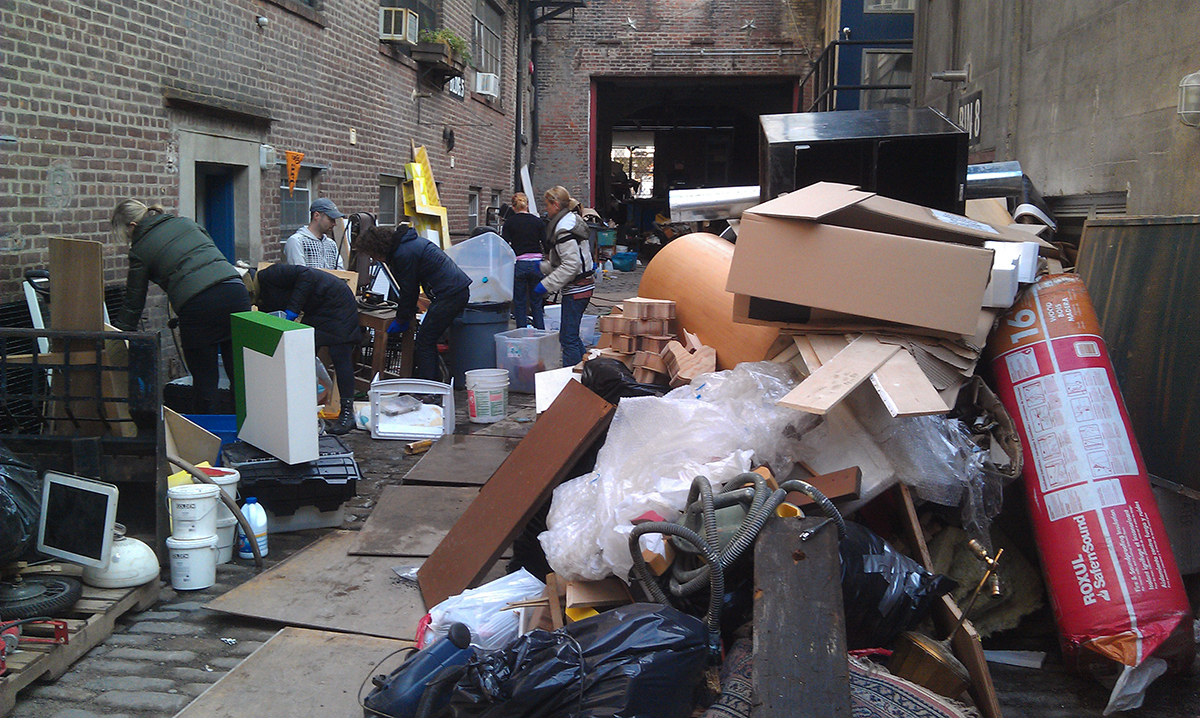
We had underestimated not only the storm but also the erosive qualities of the North Atlantic saltwater. The floodwater destroyed virtually everything that was submerged in it. All the artists in the building attempted to salvage what they could. Rachel Beach’s precise wood sculptures became swollen, their joints contorted and displaced. Most of her carpentry tools and machinery were ruined; Bill Schuck’s idiosyncratic paper and ink contraptions, built with mechanical apparatuses, were also ruined; Lee Tribe’s welded steel sculptures survived—though with undesired patinas—but the saltwater decimated his welding facility; Cy Morgan’s delicate assemblages, made with found objects and ephemeral materials such as paper, cardboard, wood, and plastics, had floated apart into unidentifiable detritus. Sorting through the aftermath in the studio and (with the help of the Rail team) cleaning up the wreckage while keeping up with the daily demands of publishing our beloved journal and other myriad commitments, was, needless to say, a profoundly memorable experience. Not since the formative years of the Rail had I felt such a communal spirit. Everyone rose above his or her usual capacity to keep the publication running smoothly, and stayed late to restore stability to the studio. During the course of recovery, I willfully distracted myself by keeping busier than ever, never stopping to dwell on the trauma. But the time to address it did come several months later.
On an afternoon in early June 2013, Jack Flam paid a visit to Rail headquarters. He and I had met before a few times, but had not had a chance to talk at great length. I had known his books on Matisse since my college days, and so looked forward to talking about French painting. But our conversation turned out to be quite wide-ranging and free-flowing, and touched on poetry and music as well as art. Then at one point Jack asked whether I would consider curating an exhibition to mark the occasion of Hurricane Sandy’s one-year anniversary at the Dedalus Foundation’s satellite space in Sunset Park’s Industry City. I accepted his invitation without blinking an eye because I felt I was about to embark upon something of great symbolic significance. I remembered this story told by Oscar Wilde:
There was a king with one eye. To replace the missing eye the king searched across the land and found a renowned magician whom he commissioned to craft him an artificial eye. When it was complete, no one in the kingdom could tell the difference. One day a murderer was brought before the king, to be either pardoned or put to death. The king told this murderer of his artificial eye and its perfection, how no one in the court and the kingdom could tell the difference. He said, ‘Now, if you can tell me which eye of mine is real, I will pardon you!’ Without a blink and barely a glance, the murderer responded, ‘Your right eye is the real eye, your majesty.’ The king, impressed by the murderer’s quick reply said, ‘You’re right! But how did you know?’ The murderer answered, ‘I know because the right eye has a glint of mercy in it.’ 2
I believe that intuition should be used judiciously—but decisively, when it’s important. At that moment, I trusted my intuition.
I took part in several meetings with the principal owners of Industry City, but I entrusted Jack to be the main proponent to rally the collaboration between the Rail, the Dedalus Foundation, and Industry City. As our working relationship developed and became firm, our exhibition expanded from a 15,000-square-foot space to six spaces, scattered through the enormous building and its expansive courtyard, which altogether totaled 100,000 square feet, three times bigger than the Whitney Museum’s exhibiting space. I chose to take on a space of this magnitude because I knew, from my experience as publisher of the Rail, that since I had access to many artists I could feature a wide range of the art that had been produced during the last few years. Although the exhibition would entail a great deal of work with a very close deadline, I thrive on working under pressure, and I knew that I would have the team at the Rail completely behind me.
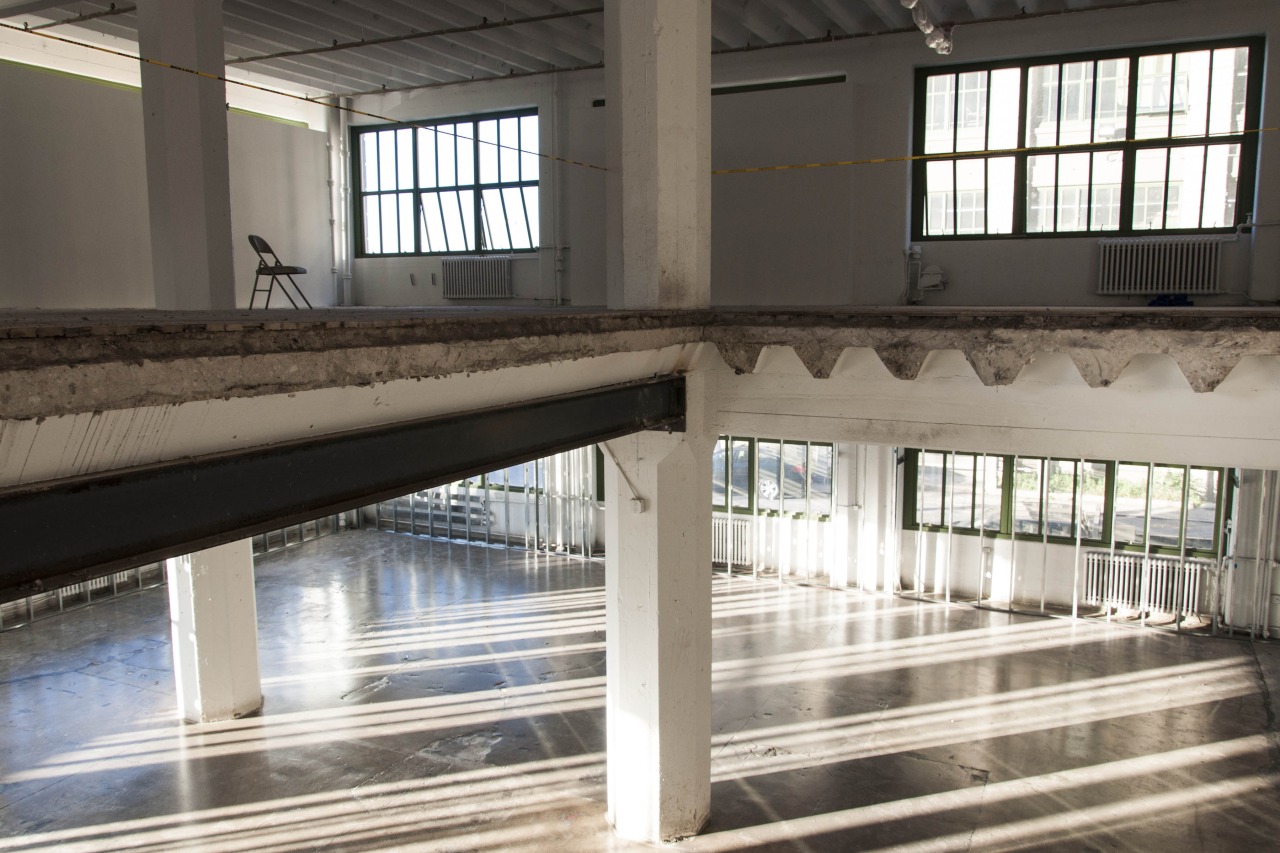
Industry City, Sunset Park, Brooklyn. Photo by Zack Garlitos.
By late June, when the total space was completely committed, I began to make a preliminary list of artists I knew firsthand in Greenpoint, Red Hook, Lower Manhattan, Staten Island, and the Rockaways who had lost work to Sandy. My original shortlist named nearly sixty artists, including Diana Cooper, Ron Gorchov, Suzanne Joelson, Ronnie Landfield, Ray Smith, Darren Jones, Donald Moffett, and Gary Stephan.
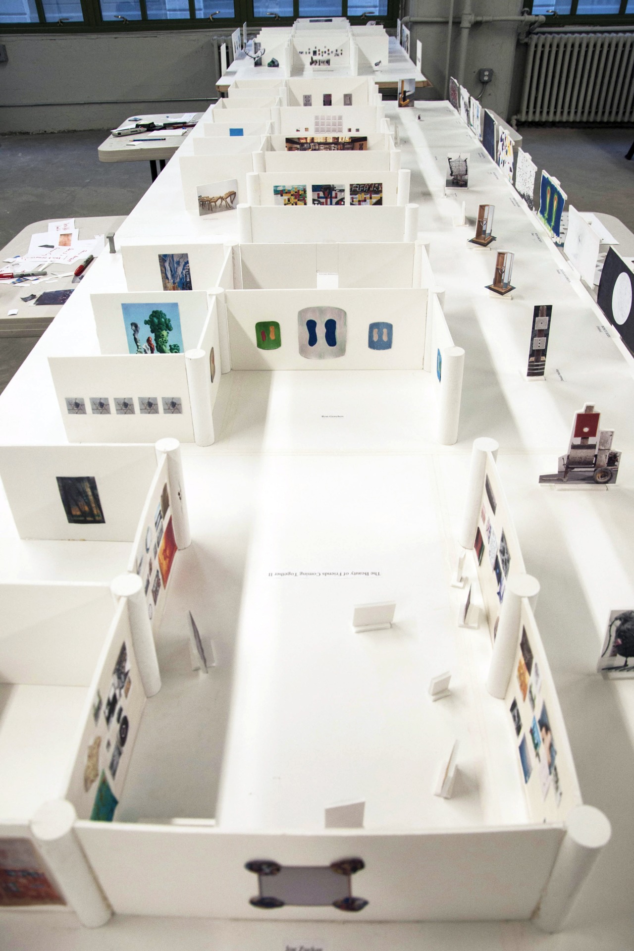
Curatorial model, built by Phong Bui and curatorial assistants. August 2013.
Meanwhile, discussions continued about the exact shape and scope of the exhibition, and we parsed out the brass tacks of transportation, budgeting, and installation. Given the size and raw condition of the space, this was no mean feat; we had to consider the cost and logistics of building out the walls, installing track lights, utilities, and insurance, in addition to taking care of security, art handlers, installers, gallery minders, and a number of other administrative expenses. I quickly assembled a curatorial team—comprised of many volunteers—which included Rail production assistants and my former graduate students at the School of Visual Arts. Cy and I began to build models for the six galleries, as well as set up large wall calendars for the next four months, counting out and scheduling events for the exact number of days leading to the VIP opening that was planned for October 17, 2013. Even before many details were finalized, I began an exhaustive schedule of studio visits. We were off to a running start.
“Call and Response” Curation3
To live in a long tube, be thin. To live in a barrel, be round. 4
Vietnamese Proverb
The first two weeks of July proved to be the most challenging in clarifying the vision of the exhibition. How could we devise a legible, efficient timeline on everyone’s calendar with such a sprawling, massive project? We hit a roadblock when we discovered that several organizations, such as the New York Foundation for the Arts and a number of Sandy-damaged Chelsea galleries, were unable to disclose their lists of artist victims for legal reasons. Since people are often ill disposed to look backward, especially to tragic events, I realized that we had to proceed quickly, and with other options, namely, by having the artists themselves be the main resource.
On Wednesday, July 3, I visited the ground-floor studios of James Hyde and Josiah McElheny. Both artists have studios in a building close to the Gowanus Canal; a four-foot-high waterline was boldly visible on the building’s outside walls. Several of Hyde’s glassed box paintings were in the process of being restored. McElheny’s new ceramic kilns had recently replaced those that had been shattered by Sandy. All of their walls and electrical outlets had been rebuilt and rewired. Both were filled with brilliant optimism. They were excited by the exhibition, and in turn speedily suggested I immediately visit Mike Cloud, Wendy White, Dustin Yellin, Michael Joo, Bosco Sodi, and Ray Smith.
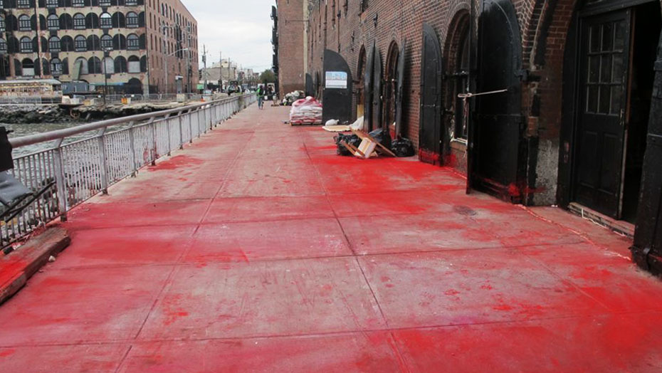
Red pigment from the studio of participant artist Bosco Sodi, flooded across the Van Brunt Street pier in Red Hood, Brooklyn. October 2012. Courtesy of the artist. Photo by Rozalia Jovanovic.
It’s important to note that though the artist network instantly spiraled outward, several were not able to participate because they either had no work or were in the middle of legal disputes with their respective galleries or insurance companies, not to mention matters such as illness or previous commitments to travel. Still, the trail branched out. Word of mouth traveled fast.
Within a day after our visits to the studios of Dustin and Ray, which was followed by a meeting with G.T. Pellizzi, they in turn provided us more names among their friends who were Sandy victims. These included Daniel Turner, Rita Ackermann, Colin Snapp, Ben Keating, Nicole Wittenberg, and the Bruce High Quality Foundation (BHQF, or The Bruce). Every single one of the artists was more interested in talking about how to rebuild and revivify what he or she could from the salvageable works, as well as ideas for the exhibition, than grieving over what had been lost.
Anecdotes emerged. Ray, for example, discovered the theretofore-unknown extent of his daughter Mariana’s organizational prowess when she charged herself with the responsibility of reconstructing his studio and restoring the works in it. She is now Ray’s studio manager. Michael Joo matter-of-factly detailed the loss of all his personal archives, along with several works from the past few years, and his precious vintage motorbikes. He spoke movingly of fellow artists Byron Kim, Lisa Sigal, and their three children, who lent their hands to clean up the studio for days and days afterward.
All of the little accidents and generous gestures of sharing reaffirmed the cause. This generative, quick pace soon led to a natural decision to forego a mournful and sad sentiment in favor of the more affirmative spirit of solidarity. The exhibition would be divided in half: one half would be dedicated to the artist victims, and the other half would be comprised of artists invited to join in the esprit de corps.
While I was in Daniel Turner’s Greenpoint studio, looking at his ambiguous sculpture (from a distance it seems to be two caskets, and up close it resembles a trough or a countertop sink), he explained how the subtle erosion and soot on the surfaces of the aluminum tops resulted from a pool of saltwater left over from Sandy’s retreat. Images of paintings of seas and lakes that I had seen in Alex Katz’s studio over the years flashed into my mind. As soon as Daniel offered his diptych for the show, I telephoned Alex. We selected three monumental paintings: Marine II, Rock 2, and Rocks. They, like the artist’s other paintings of rural Maine, were images of Lincolnville Beach, where he and his wife have spent every summer since 1952. Their sizes were perfectly proportioned to the entire front wall on the ground floor—a natural rapport. The dynamic between the works by Turner and Katz was interesting not only because they both contained representations (subtle and overt) of water as an eerie presence, but also because it embodied the cross-pollination of generations (an older artist and a younger one) and prominence (a very well-known artist with a lesser-known one). Back at the office, Cy printed out the scaled images, and the steadily filling foam core model acquired more content.
In the same way that works placed together can contrast with and complement each other, so also can an installation artist counter-balance his or her space, by sensitivity to the specific site. Diana Cooper, whose archives had been destroyed, was one of the first who came to Industry City for a site visit. She quickly noticed a sprinkler system painted in fire safety bright red at the front of the third floor. Her visual recognitions became her work’s pictorial vehicle in terms of form and color, and prompted a specific configuration of the wall build-outs in her space. In her installation of four elements (Constellation Vanity (2), Bale, Safety Last, Silver City, the viewer was faced first with a blue wall, centered by a very large reproduction of an electrical outlet and a generous patch of AstroTurf (upon which two groups of red and white plastic cones were scattered on either side). Behind this was a back wall (part of a discrete square-shaped room) that blocked the windows facing New York Harbor. Into this wall several circular holes of various sizes were cut, through which the vista of the waterfront, along with the Statue of Liberty, could be seen. Alongside the holes she placed many smaller, circular mirrors mounted on red Sonotubes. PVC pipes extending from red sprinklers wove in and out of the holes; they evoked a fragmented constellation.
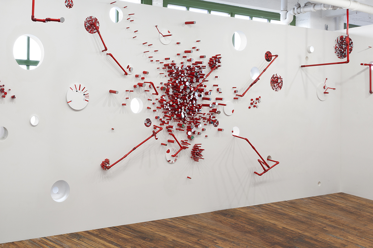
Site specific installation by Diana Cooper. “Constellation Vanity (2) (detail),” 2013. Wood, mirrors, digital prints, PVC, plexi, gels, sono tubes, canvas, felt tip marker, Velcro, acrylic on walls, 9′ 4 1/2″ x 26′ x 6′ 9″. Courtesy of the artist. Photo by Cathy Carver.
Diana’s response to detail and mass, encapsulated by the winding red sprinklers, naturally responded to G.T. (Tona) Pellizzi’s installation The Red and the Black, which was situated right next to hers. Conceptually based on Stendhal’s famous novel of the same title, the installation was made of nine plywood walls, a two-by-four-foot skeleton of a room (slightly scaled down from its original incarnation at Y Gallery on the Lower East Side). At Y Gallery, Tona had put the room’s glossy red walls up for sale by the square foot according to the real estate values of the neighborhood; on the final day of the show they were cut to order. In Come Together, Tona’s piece, now the armature alone with its carpeted interior, altar-like pedestal, and a couple of cut pieces hanging on the wall nearby, occupied just a fragment of the third floor space. The stark contrast to its original context introduced issues of displacement, re-placement, and the slippage of capital into the work.
Meanwhile, the organizational meetings continued to evolve with positive results. Additional funding was committed by the Dedalus Foundation and Industry City, and a vigorous public relations campaign was mounted. We decided to use BHQF’s Raft of the Medusa on posters, t-shirts, and the website. The central image is a copy of Géricault’s Raft of the Medusa—a painting famously depicting a news story of the time about the heroism and treachery of desperate passengers on a wrecked ship. BHQF’s version is set on the shores of the East River, and mingles absurdity with the aftermath of a storm. Rail Art Director Walter Chiu designed the Sandy logo—which graced not only all promotional materials but also an enormous banner that flew outside Industry City’s massive warehouses—in response to this image. The logo features a circle—the universal symbol of unity and continuity—with a pigeon inside, flying while grasping a rat in its talons. We all know there are plenty of rats in New York (and pigeons!). They are tough and durable. The much-maligned pigeon is essentially the larger version of the peace-evoking dove—and it was a dove that found land when Noah’s Arc was afloat, as the story goes. The absurdity of this unlikely friendship, and the deliverance from the deluge to a new beginning—in essence, their solidarity to be free—carries the pair over the lapping wave within the circle. Artists, more than most, understand the relentless struggle required to sustain a rhythm of work over a lifetime. And they also understand the lightness of spirit they gain as a reward. In times as unnatural as natural disasters, that lightness of spirit comes from the artist’s community, as the words that curl around the logo’s outer edge indicate: “Come Together.”
Installation of Nari Ward’s “We the People,” October 2013. Photo by Taylor Dafoe.
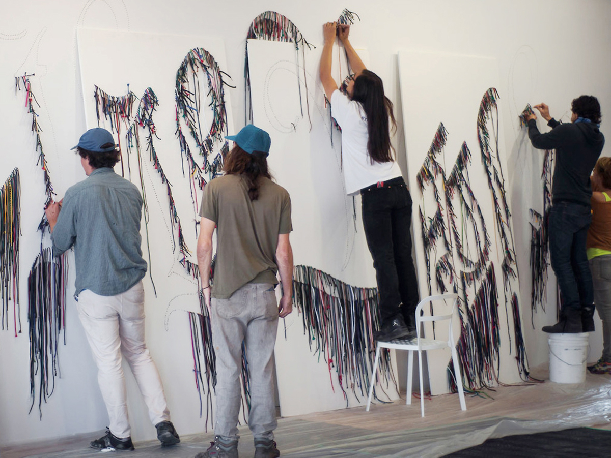
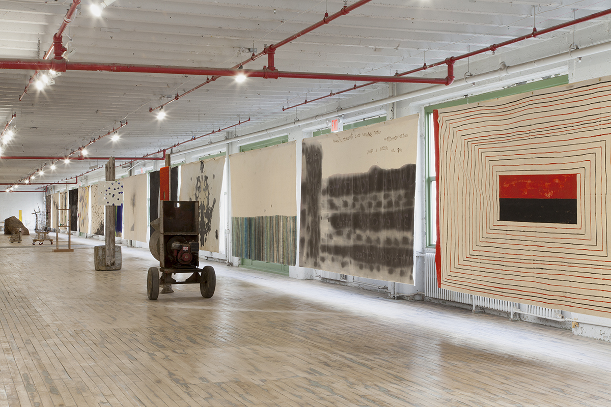
The exhibition spaces began to take shape. Floors were patched and sanded. Walls went up. And every day it seemed the total budget needed to be adjusted to accommodate the needs of the art. Several artists (or their gallerists) whose works were heavy and large in scale graciously offered to cover transportation costs themselves (notably Mark di Suvero, Mel Kendrick, Joel Shapiro, and Dustin Yellin). Many others volunteered to bring their works to the site on their own (including Ethan Ryman, Cordy Ryman, Ben Keating, Ray Smith, Chris Larson, who drove from St. Paul, Minnesota, and Cameron Gainer, who flew over from Minneapolis). And almost all of the 200 participants of The Beauty of Friends Coming Together I and II brought their own works (see chapter 3).
Dustin Yellin’s The Triptych—a 12-ton glass, acrylic, and collage sculpture measuring 49 by 216 by 27 inches and resting on six blocks of solid wood—most directly addressed Sandy’s deluge. I first saw it in his Red Hook studio and knew immediately that I wanted to feature it. It’s a visual feast that prompts simultaneously apocalyptic and utopian visions, while achieving the improbable synthesis of pseudo-history, pseudo-science, and pseudo-archaeology, ultimately fusing the senses of times past, present, and future. The Triptych, a scene of the artist’s “Lost City of Atlantis” series was finished just weeks before Sandy’s arrival—soon after its creation, it was submerged in the storm’s floodwaters. (Thanks to the glass’s impenetrable surface The Triptych was untouched by the water.)
Dustin Yellin, “The Triptych (detail),” 2013. Glass, acrylic, collage, 49 x 216 x 27″. Courtesy of the artist. Photo by David Deng.
Installing it was a feat. We had to consult with Industry City’s Chief Engineer Dan Wapner, who provided exact instructions on loading the work, which Dustin’s own team efficiently carried out. (Dan had raised the question of installing I-beams as a supporting structure to the basement ceiling, but he came to the conclusion that the concrete floor was strong enough; and indeed it was.) After the apprehensive installation we saw it was a “coup d’état,”5 on both counts—Dustin’s final commitment to display the work and the success of the installation—as the artist himself said; it held the weight of deceptive translucency.
Ben Keating’s solid aluminum casts of dilapidated furniture (Living Room Trio, Portrait of her by a sculptor 1pm, Portrait of her by a sculptor by 7:30pm, Her Door is Always Open, On her time) looked as though they had been sunk within Atlantis. Culled from his now-deceased grandmother’s home, as though they were metaphors for the violence of devastating weather that flooded his entire studio with water from the East River, the objects felt like an exploration of the power of negative space. One senses that Ben is gesturing an equally assertive puncture as that of Lucio Fontana’s powerful slashed canvases.
As the process of building the exhibition developed, so did the athleticism of the whole endeavor. And I don’t mean my own—although I did plenty of running around—or that of the workers, though their labor was tremendous. What I’m referring to is the energetic “call and response” pattern that began to take root and grow. One finds the call and response in sports arenas or in protests; it creates enthusiasms, forges connections, and transmits messages. With each new artist added, an apt reply seemed to almost automatically appear. The instruments of many different minds came together and became orchestral.
Ray Smith has been a mentor figure for his younger comrades of The Bruce; since the collective was founded in 2004 (in the same Bond Street studio as Ray’s), they have in so many ways reaffirmed the fluidity of collaboration. In this exhibition, Ray’s sculpture of a quasi-figure with an enormous head, Keegan, stood on the threshold of the ground floor gallery like a guardian angel-cum-club bouncer. His three other abstract assemblages, Chico Huevon, La Inferneva, Pollo Peking, demonstrate his masterful ability to maximize simple materials and forms into endlessly associative images. Ray was also able to turn the havoc wrought by Sandy to positive advantage. Sandy’s saltwater had created irregular patinas and rust on the wood and metal surfaces, which he was able to assimilate into works that fed off the vigorous collision between abstraction and figuration without trivializing either. The spirit of anarchy and critical perspective that bubbles below the surface of Ray’s sensibility is also evident in The Bruce’s oeuvre. BHQF is generally known for the way it makes institutional critiques through playful intervention. The two works featured in the show, Stay with Me, Baby and Pizzatopia, are as much about the intense economics of New York City as about the issues of labor and authorship. These pieces were sequestered in an iron and glass room on the first floor, a cage of sorts, in which they evoked the intersections of history and art. Stay with Me, Baby (two blow-up union picketing rats; one inflates while the other deflates, like lungs) evokes the flying pigeon grasping her hanging rat; the intersection of the two animals displays a solidarity to be free from the cage.
Color and light, as well as order and spontaneity, also began to evoke “call and response” throughout the show. Joanna Pousette-Dart’s geometric abstractions and Ronnie Landfield’s lyrical abstractions, facing each other from opposite walls, were equally compelling in contrast. Joanna’s 2 Part Variation (Yellow, Red, Green, Black) and 2 Part Variation #2 (Red, Yellow, Blue) avoids identification with a pre-determined language of abstraction, and offers a highly personal commitment to expand the constraints of particular, curvilinear color modulations. The shaped canvases are stable in form yet unstable in movement. Landfield’s soft edges and infused images, by contrast, refer to natural phenomena. The Deluge and After the Deluge seem, in both their titles and pictorial language, predictive of Sandy by more than a decade.
SUPERFLEX’s film Flooded McDonald’s inadvertently augured Sandy’s arrival by more than four years. I thought of this work, in fact, as one of the hearts of the exhibition, and it was displayed in the very center of the third floor center gallery. Flooded McDonald’s depicts a spot-on replica of a McDonald’s interior gradually filling up with water until it is flooded from floor to ceiling. This extraordinary film—at once lyrical and violent, funny and frightening—engages the consequences of climate change and global warming. Its subtle biblical references also offer a social critique of corporate culture and of capitalism itself.
Among other works that related indirectly to the storm were Cameron Gainer’s video Luna del Mar, in which, Luna del Mar Aguilu, an Olympic synchronized swimmer, spirals in slow motion through a bay of bioluminescent plankton against a score of ethereal strings, invoking an embryonic image akin to Jackson Pollock’s The Deep. Juan Gomez’s monumental canvas Mawinzhe evokes an indecipherable atmosphere that is neither polluted air nor mucky, toxic water. And Max Becher and Andrea Robbins’s three photographs of Las Vegas’s kitschy replica of Venice—Venice, Las Vegas #1; Venice, Las Vegas #2; Venice, Las Vegas #3—seemed to suggest the real fragility of the frequently flooding real city of Venice, Italy, rather than just the artists’ usual document of what they term “the transportation of place.”6

Stephen Antonakos “Blue Incomplete Circle on Blue and Red Wall,” and Mel Kendrick “Spool #1,” “Spool #2,” “Spool #3.” Installation view. Photo by Brian Buckley.
The Sandy exhibition featured the last collage and neon installation of the late Stephen Antonakos—a true privilege. Stephen was one of the first artists who came to see the site when the space was in its raw condition, and he was able to select and design two works for two walls just before his passing two weeks later. Stephen’s Blue Incomplete Circle on Blue and Red Wall generates a cradle of comfort through time; his incomplete circle adroitly recalls Uccello’s crescent moon in Saint George and the Dragon. The beauty of the gentle blue was a constant source of solace and joy for our curatorial team and Rail office staff, who worked alongside this piece for the duration of the show.
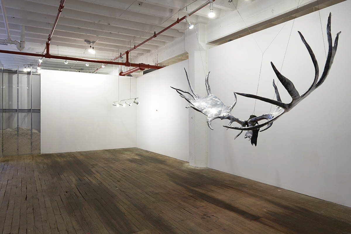
Site specific installation by Michael Joo. “Megafawn (Extincted),” 2010. Urethane, polyfilm, aircraft cable, 56 x 108 x 48″. Courtesy of the artist. Photo by Zack Garlitos.
Michael Joo and Francis Cape had an understated, but potent, rapport. Michael installed an ensemble of five works: Megafawn (Extincted), Drawn (Japonensis), Untitled (Herkimer Unfolded), Untitled (Impacted), and Parasite (Landscape). The first four are reconfigurations of his ongoing Sisyphean excursion into the terrain between nature and human intervention, science and religion, fact and fiction. In the fifth piece, Parasite (Landscape), Michael reconstructed a partial wall (only the aluminum studs exposed) of his Sandy-damaged Red Hook studio. Having noticed Francis’s poignant installation in a room nearby (a series of eleven color photographs showing the waterline marks left on houses in New Orleans after Hurricane Katrina, reiterated in the exhibition space by actual wainscoting built to the height of the water), Michael poured a substantial portion of road salt between sheets of glass slid between his studs to match the height of Francis’s wainscoting. It was a subtle homage paid at once to the memory of Sandy, to a fellow artist in the exhibition, and to the horrific Hurricane Katrina.
By a wonderful stroke of luck, we secured in their entirety a group of thirteen painted backdrops (98 by 187 inches each), made by thirteen artists to accompany a program of jazz-inflected opera (Vivere), organized by Bosco Sodi as a Sandy fundraising auction in his Red Hook studio in May 2013. All proceeds benefitted the post-storm rebuilding efforts in the neighborhood. The participating artists included Teresita Fernàndez, Natalie Frank, Ron Gorchov, Douglas Gordon, Michael Joo, Antón Lamazares, Adam Pendleton, James Siena, Ray Smith, Bosco Sodi, Mickalene Thomas, Corban Walker, and Dustin Yellin. This expanse of immensely varied imagery and styles miraculously fit the long stretch of the large third floor middle gallery space and embodied in a wonderfully persuasive way the communal spirit of artists coming together for a cause.
Sculpture Hall with Viviere Series and Donald Moffett, “Lot 080711 (the radiant future).” Installation view. Courtesy of the artists. Photo by Rachel Styer.
While conceiving the geography of the exhibition I consciously applied the “call and response” conceit to my fullest ability, as the selected works kept providing plenty of similarities and dissimilarities, pairs, parallels, and patterns. I also found great pleasure in maximizing other more subtle options when possible. For example, taking a cue from Diana Cooper’s embrace of the red sprinklers, I selected two large canvases by Chris Martin, Red, Yellow, Green #1 and Red, Yellow, Green #2, both painted with precarious, robust rectilinear grids comprised of red, yellow, and green, hung facing each other in the second floor front gallery. A constellation of John Newman’s six small, highly idiosyncratic sculptures, some inflected with glowing red and yellow, were set in the middle on a low table. Between Chris’s paintings, John’s sculptures, Stephen’s neon, and the pipes, the colors and forms were in constant conversation.
Nearby, in front, works by Wendy White, Mike Cloud, Allan Graham, Loren Munk, EJ Hauser, and Ben Keating were installed on one wall to call attention to their shared interest in text-based images. Visual conversations ranged from Wendy’s focus on urban ephemera (advertising, posters, and other frenetic graphics) to EJ’s painterly turns of phrase, which seem to propose and revise legible structures. This wall also included Ben Keating’s small, improvisational welded works on the floor, far below Allan Graham’s highly premeditated, thoughtful reduction of typographic form and semiotic ambiguity (in an unusually elongated horizontal format). Finally, Mike Cloud’s irregularly sized hexagonal canvas pleasantly collided with Loren Munk’s offbeat diagrams of reconstructed art history.
The sculpture courtyard required a tremendous amount of planning. Given the size of the space and the large scale of the works, decisions had to be made quickly about the number of artists who would be included, and about which pieces might be made available from the artists’ studios or galleries’ inventories. Although the process was very complex, the selection and installation actually took less time than initially planned—because to some degree the works seemed almost to choose themselves. After my first visit to Lee Tribe’s studio in late July, I knew that I would include the three quasi-figural, totem-like welded steel sculptures, Orator I, Wisdom, Orator II, Dignity, and Orator III, Aspiration, which are static yet dignified in their upward verticality. I also realized that they would be effectively complemented by Joel Shapiro’s Untitled—a bronze work I had seen first in the artist’s exhibit at Pace Wildenstein in 2008 and numerous times afterward, standing in front of his Long Island City studio. In my opinion, it is by far the most complex, up-to-date work in Joel’s oeuvre; in it he articulates a perfectly engineered joinery that oscillates between a quick and slow malleability while retaining the abstract presence of a human body.
The courtyard lights, 20 feet above the ground, dictated the height limit for the sculptures, so works had to be somewhere between 9 and 15 feet. The amplification of differences made visible between Mark di Suvero’s Rust Angel and Mel Kendrick’s Marker 4 and Marker 5 was a particularly rewarding moment. Mark’s piece was created out of a single, large painted steel plate, cut in such a way to allow its sweeping curvilinear forms to bend and extend in two directions, which were then bolted by a steel beam from either side. In Mel’s works, each cast concrete layer was stacked with the negative (internal section) on top of the positive (external section), in addition to the black and white striations. Both pieces together emphasized their solidity and architectural weight, and as winter approached it was a joy to see them covered in snow.
Rona Pondick and Robert Feintuch. Installation view. Courtesy of the artists. Photo by Zack Garlitos.
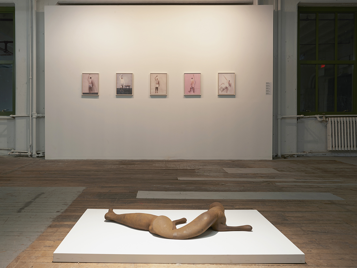
My first visit to the studio of Rona Pondick, a Sandy victim, in late July initiated a concept that became central to the exhibition design: artist couples. Robert Feintuch, Pondick’s husband, makes luminous, small paintings (self-portraits, sometimes with full figures and other times with body fragments) that I thought could be shown together for the first time with Rona’s sculptures of merged human and animal bodies. The two presented a compelling contrast.
In an adjacent gallery, Bill Jensen and Margrit Lewczuk shared the center wall with a constellation of primarily smaller works on paper. Bill’s work is obsessively emotional and fuses gravity and matter together in a single improbable unity, as seen in Passion According to Andrei (Rublev/Tarkovsky). Margrit creates a musical accompaniment of ubiquitous signs and symbols that feed off lightness and convergence, as affirmed in Connie’s Dream and Green & Purple. Among the artist couples shown, their works were probably the most startlingly different from one another—polar opposites.
Thomas Nozkowski and Joyce Robins, who have been together for over four decades, switched places in their respective mediums in the early 1980s. He completely stopped making sculpture and focused solely on painting canvases that initially measured exclusively 16 by 20 inches (in recent years he has increased the dimensions to 22 by 28 inches). She, on the other hand, ceased to paint in favor of a commitment to painted and glazed ceramic sculptures. Both credit their mutual fascination with abstraction to a continuing dialogue, which has lasted since they met in college in 1962.
Carrie Moyer and Sheila Pepe have long been committed to their shared ambitions—art, politics, and feminism—while pushing and extending the boundaries of lyrical abstraction. For Carrie, the visceral coalescence and graphic clarity of boundless abstract shapes and infinite explorations of textures have been the main vehicles in her painting. For Sheila, the simultaneity of a site-specific, web-like installation of her hand-knit, crocheted textiles and her mixed-media sculptures bespeak the intrinsic beauty that lies just below the vivid, subversive spirit of rebellion.
James Siena and Katia Santibañez, while sharing similar pursuits of visual algorithms through the intricacy of patterned abstractions, set forth their own independent inquiries into geometric interlace, patterns that emerge from difference and repetition. James’s Leviathan and La Grotte et la Falaise demonstrate his concern with the negotiation of a priori mental images through a given regulated procedure. Katia’s Between the Waves and Shadows Upon Shadows make the case for the coexistence of abstraction with occasional representational, natural forms.
A Social Sculpture/Environment
Art as social activity. 7
-Tom Marioni
The most unwieldy, exciting task was figuring out how to materialize this large-scale exhibition alongside the Brooklyn Rail’s operations. Unsnarling unimaginable logistical complexities, spending endless evenings and weekends making back-to-back studio visits (189 in total by the end of August), while feeding off the collective excitement that our activity generated, we were able to install over 600 works of art by more than 300 artists in less than three weeks. We worked in one gallery space while the walls were still being built in another. (A striking quality of scale is its ability to change as a person changes; in this case, after just a couple of days the spaces began to feel quite manageable, even small to me.) The decision to move the Rail headquarters from Greenpoint to be a part of the exhibition was a natural solution to the problem of looking after the editorial demands of the journal during and after the installation of the show. The Rail headquarters has been a live/work space in my loft since October 2003, when the Rail transitioned from a bi-monthly to a monthly publication. Since I’ve been personally so invested in the lived experience of art and culture, I find living and working are inseparable from one another.
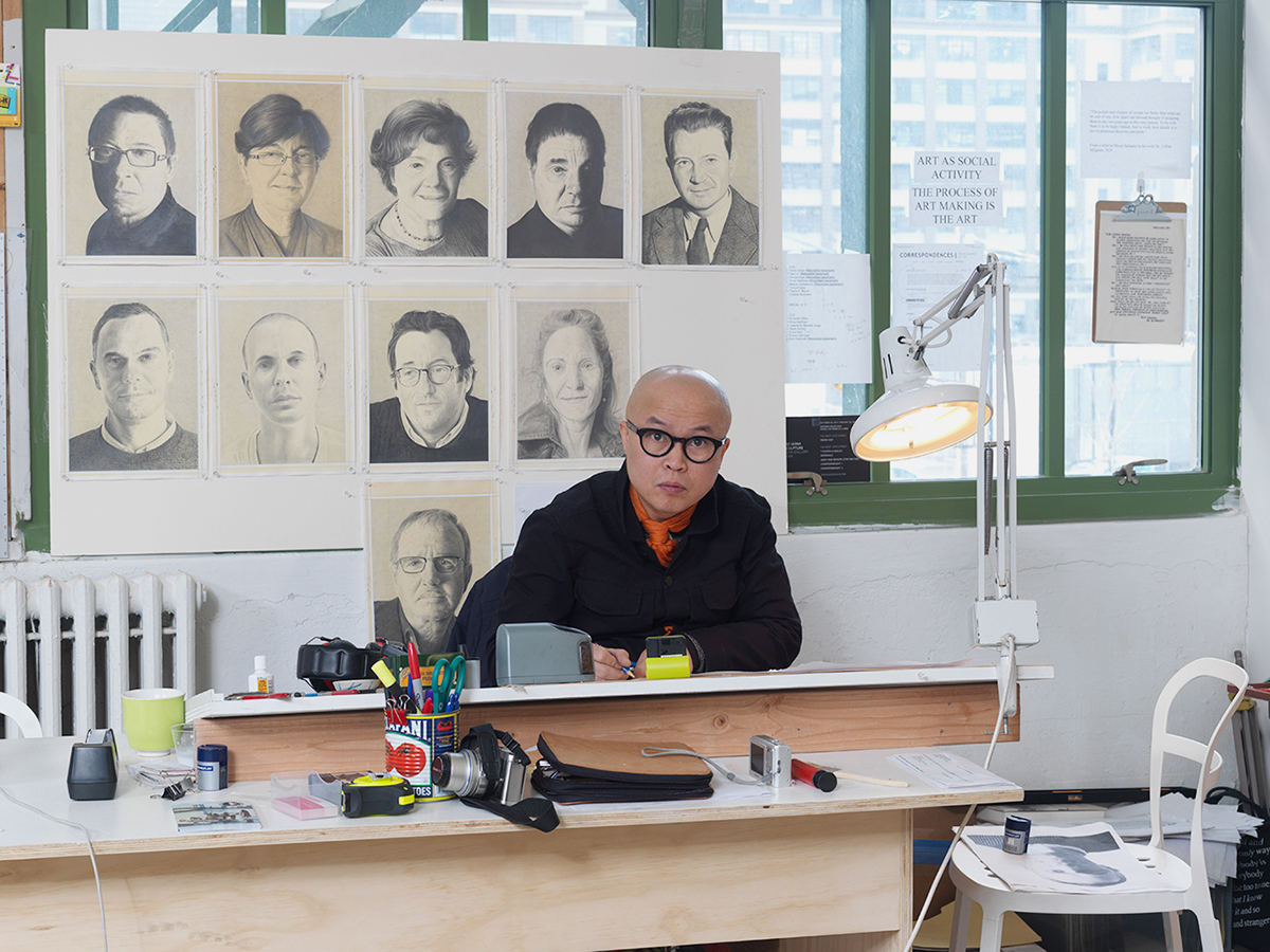
Phong Bui at work on monthly portraits, to be published in the Brooklyn Rail. Photo by Brian Buckley.
At Industry City we constructed six solidly built tables, placed them directly in front of six large windows, and equipped them with several computers and laptops. One-half of my table had an adjustable top for making portrait drawings for the three issues of the Rail that would be produced in the space (November 2012, December/January 2013, and a special Ad Reinhardt centennial issue that was created while the show was on view).
There was a large, dramatic opening in the middle of the second floor, accessible from the first floor by a metal staircase that arrived the day before the opening. This second floor space was an ideal location for our temporary office and provided plenty of room to host additional events, including poetry and fiction readings, performances, film screenings, and panel discussions.
The Brooklyn Rail as Social Sculpture. Installation view. Photo by Brian Buckley.
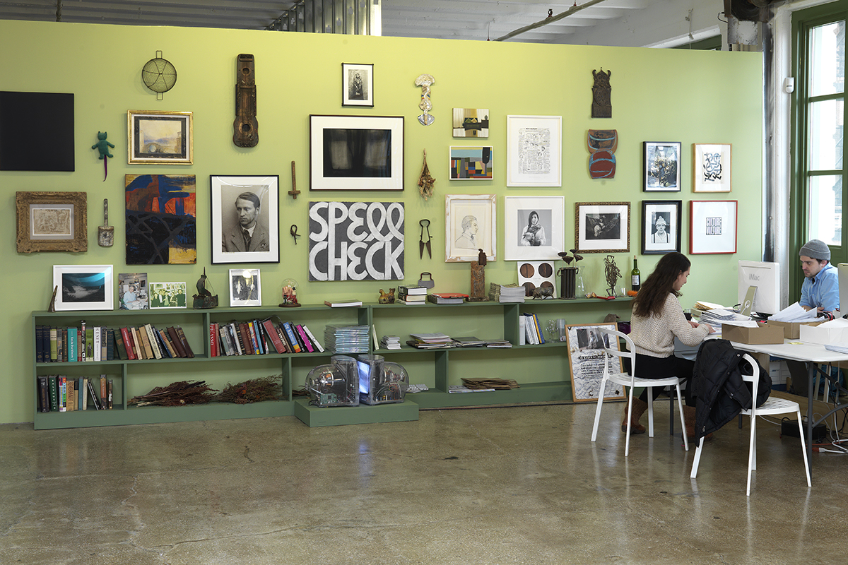
The two large walls on either side of Stephen Antonakos’s neon piece were painted a light olive green color, nearly identical to the green on Wendy White’s two big paintings across the room. The color subtly enclosed the space, providing respite and intimacy. These two olive walls were filled with an eclectic selection of works: prints by Goya and Johann Christian Reinhart; a small oil of a beach scene by Eugène Boudin on loan from a friend; Jonas Mekas’s “self-portrait”; an oil painting by Meyer Schapiro; and an exquisite ink drawing by Ellen Phelan, among other works. These were installed alongside other objects, such as old fishing lures, non-functional carpentry tools, metalwork, and flea market bric-a-brac. This “salon style” installation was another expression of the theme of “coming together,” which recurred throughout all aspects of the installation and programmed events. The inviting array of objects and images generated more warmth than a formal, conventional display would have done, and provided a pretext for filling the wall without making it appear cluttered or too busy. It harmonized with our ever-evolving concept of visual democracy, which required a supple mindfulness to embrace stability and instability, high and low, beauty and horror, right and wrong, and other pairs of apparent opposites with apparent equilibrium. To “call” and to hear a “response” is unlike shouting into a ravine, where all you get is an endless repetition of your own echoing cry. The magnificent unknown of others and what they do generates unexpected responses that in turn generate energy in the in-between that makes us feel alive.
The Beginning of Becoming
The fine arts and unity of mankind. 8
-Meyer Schapiro
Among other things, this exhibition offered an opportunity to materialize the spirit of the Brooklyn Rail. As I proceeded, I worked to have its poetic and democratic sensibility resonate with those of us who can’t imagine living life fully without the arts and humanities. My staff and I, and Jack Flam and the members of the Dedalus staff, all had similar feelings about this. Katy Rogers, the Dedalus Programs Director, organized more than half of our featured programs, all of which were as significant to Surviving Sandy as the installed artworks. Every one of us knows the amplified insights and emotions one feels in the presence of an artwork, just as we all instinctively understand the significance of an encounter with a great dance performance, a moving poetry reading, a memorable concert, or an unforgettable discussion around the human struggle to find meaning in life.
Thinking back now about the storm surge and the resulting exhibition, I recall Uccello’s fresco Flood and Waters Subsiding at Santa Maria Novella and Cimabue’s Crucifix at Santa Croce, which were among the 14,000 works of art damaged or destroyed by the 1966 flood of the Arno River in Florence. Many organizers rose to that occasion, most famously Franco Zeffirelli, whose short documentary, Florence: Days of Destruction, helped raised millions of dollars for the reconstruction efforts. The film also popularized the term “mud angels”: volunteers who cleaned the city of refuse, mud, and oil, and who retrieved numerous works of art, books, and other priceless Florentine artifacts. I relate to what then-mayor of Florence, Mario Primicerio, remarked at the thirty-year anniversary of that event in 1996:
What we were doing was dictated by the desire to give back the traces of the history of the past to future generations, so that it could be used for the spiritual growth of people who perhaps had yet to be born . . . It was the international community that worked to try to save Florence, this unique patrimony which belonged to the whole world.
In the end, Come Together: Surviving Sandy, Year 1 offered all of us—the people involved with the Brooklyn Rail, the Dedalus Foundation, Industry City, the Jamestown Charitable Trust, the participant artists, writers, poets, dancers, musicians who were involved in the event from beginning to end, and the viewers who came to experience it—a concrete manifestation of collaboration, where everyone is in service to the same cause. This is when we all understand, along with John Keats, that “the excellency of every art is its intensity, capable of making all disagreeables evaporate.” 9 As one of my favorite philosophers, Johann Gottlieb Fichte, once said, “We do not act because we know. We know because we are called upon to act.” 10
- Original: “Certains souvenirs sont comme des amis communs, ils savent faire des réconciliations.” Marcel Proust, In Remembrance of Things Past. New York: Random House, 1981. Trans. C. K. Scott Moncrieff, Terence Kilmartin, and Andreas Mayor.
- According to Dr. Lillian Milgram Schapiro, her husband Meyer Schapiro related this story to her in the fall of 1990. It was also in reference to Paul Tillich’s popular volume The Courage to Be (1952), which I had just read a month before.
- It was Jack Flam who, in the course of a discussion, commented on my constant reference to oppositions, and casually brought up the term “call and response,” which I am grateful for. It is fitting to put it to use in this essay.
- I first learned the proverb from my grandmother at the age of six or seven.
- Dustin said this to me during the VIP reception on October 17, 2013, for having convinced him to show his Triptych in the Come Together: Surviving Sandy, Year 1 exhibition.
- Lucy Lippard, Andrea Robbins & Max Becher: The Transportation of Place. New York: Aperture, 2006.
- “Constance Lewallen in Conversation with Phong Bui,” The Brooklyn Rail, July/August 2013.
- Meyer Schapiro, Worldview in Painting–Art and Society, Selected Papers. New York: George Braziller, 1999.
- John Keats, “On Negative Capability: Letter to George and Tom Keats, 21, 27 December 1817,” in Grant F. Scott (ed.) Selected Letters of John Keats. Cambridge: Harvard University Press, 2005.
- Original: “Wir handeln nicht, weil wir erkennen, sondern wir erkennen, weil wir zu handeln bestimmt sind.” Johann Gottlieb Fichte’s Popular Works (London: Trubner & Co: 1873). Trans. William Smith.